Revamping the B2B experience for adidas
Brief debrief
adidas sells to its retailers through a platform called CLICK, and by 2018 its poor usability was pulling down customer satisfaction. I was brought in to lead the redesign. The goal was a tool that handled dense business data and was still as pleasant to use as a good consumer app. We split the work into two tracks: an 11-week sprint to fix the basic interface problems, then a design team working inside adidas to rethink how retailers buy at scale.
Results
- +$5M in revenue from the interface changes alone
- 20% faster page loads
- +33 Net Promoter Score by 2020, up from below zero
The immediate fix: “Pleasant Productivity”
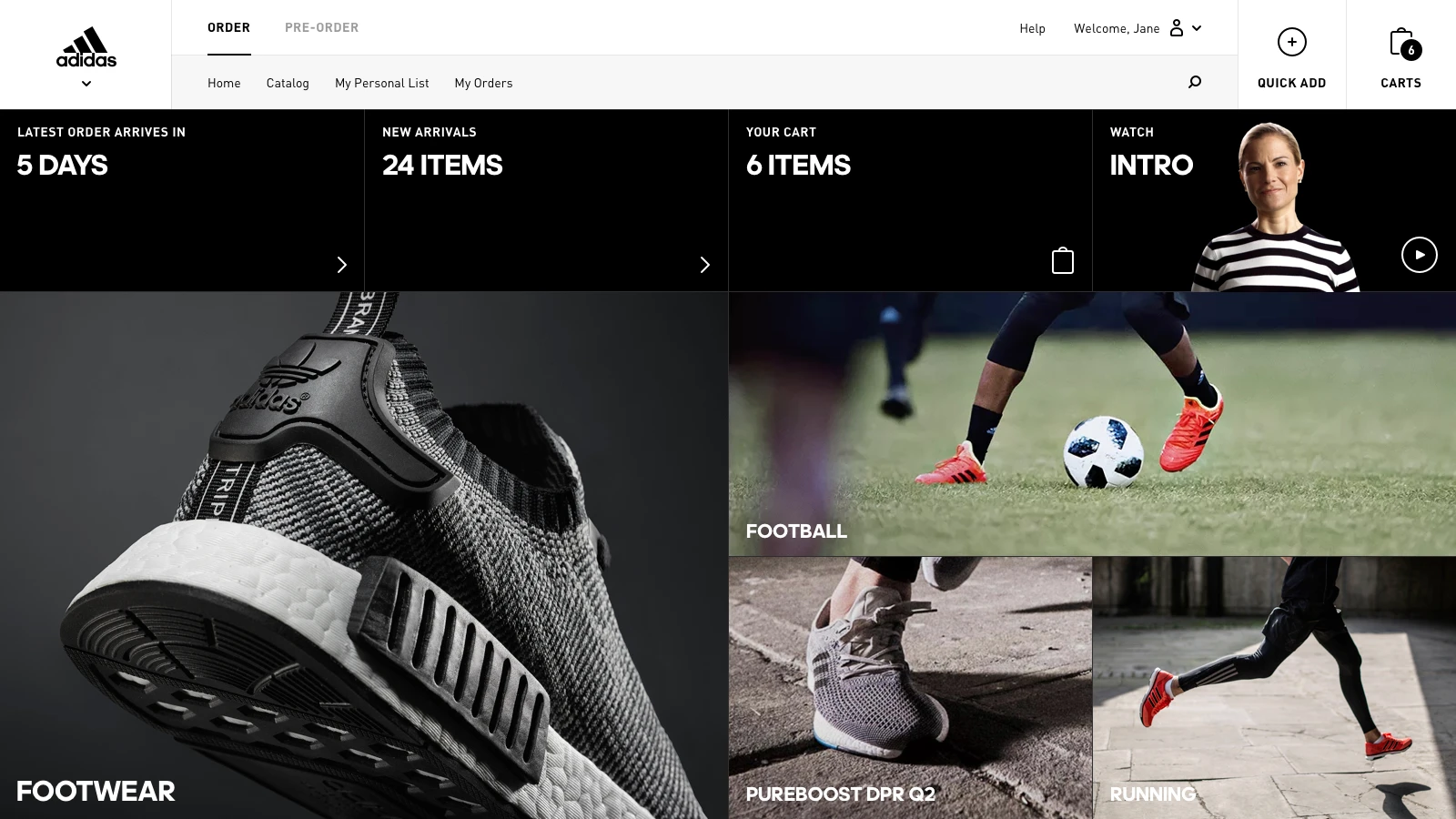
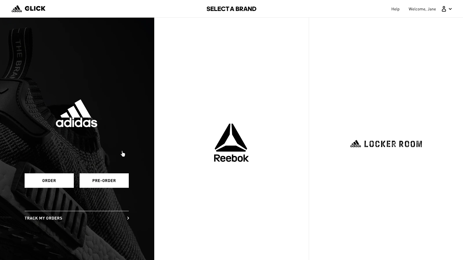
Our audit of CLICK found cluttered screens, too much information at once and navigation that worked against people. In the first track we shrank the sticky header to free up space, made switching between brands clear, and set up an atomic design system (fonts, colour, visual hierarchy) so the fixes would carry across the platform.
That first round landed fast. Pages loaded 20% faster and conversion rose 2%, which added $5M in revenue from the interface changes alone, without a single new feature.
Rethinking how retailers manage orders
The harder half was rethinking how a retailer works with large amounts of business data. Our UX team joined the adidas Scrum team to map behaviour that depended heavily on the backend. I oversaw the redesign of the Orderbook Toolkit (OBT) so it could handle long order numbers and detailed filters, and pushed for features that warn dealers before something goes wrong, like a “Pending too long” alert.
Fixing these long-standing usability problems turned user sentiment around. The Net Promoter Score (NPS) went from below zero in 2017 to +33 by 2020. We also changed how adidas builds: after moving to a joint production model, the team deployed 220% more often.
Getting the details right
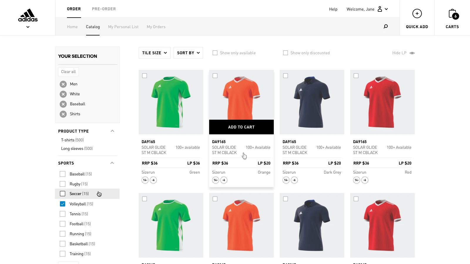
Business buyers placing big wholesale orders still expect shopping to feel like a good consumer site. I guided a redesign of the product catalogue. We added adjustable tile sizes so buyers could scan products on any screen, and built 360° product rotations into the product pages instead of filling them with more images.
Time on page went up 12%. A lot of this came from getting everyone aligned early: our first strategy workshop scored 9.8 out of 10, the highest score an internal workshop had ever had at adidas. It set the tone for a close, fast-moving partnership that changed how adidas teams approach digital product design.
Explore more
Transcript
When I was brought in to work on adidas Click, we had a team of developers helping them out on this platform. It’s the business-to-business commerce platform of adidas: it’s how they sell to resellers. They were looking to improve the overall experience, because it looked a lot like the consumer experience, but not quite: it had some different elements, and it just didn’t look very consistent.
So we ran two tracks. A really fast track where we did the obvious optimisations (a lot of front end, a lot of CSS, very quick) just to lift the general hygiene of the experience, which already did a lot. We were finished in no time and already saw an uptick in sales, simply because everything was a little more accessible and a little more consistent.
And then a second, slower track, where we really started to understand the big, unique jobs this platform had to do, and aligned the different teams of adidas behind those jobs.